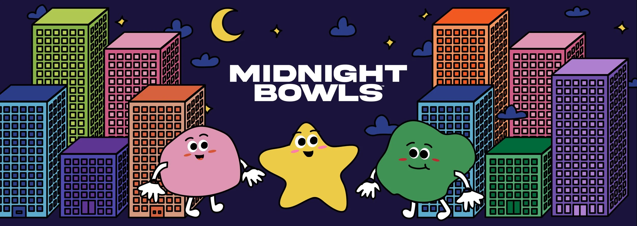
Midnight Bowls set out to make shelf-stable meals feel like something worth looking forward to, not a pantry compromise. I created a bold, approachable identity and packaging system aimed at young to middle-aged customers who want healthy, well-rounded meals without the prep. The brand looks as good on the shelf as it tastes in the bowl.
Midnight Bowls – Brand Identity & Packaging
ROLES & RESPONSIBILITIES
As the Brand Designer, I owned the visual identity from first concept to final packaging, covering the logo, color and type system, and the structure and layout of the packaging. I made sure every design choice supported the brand’s promise of convenient, healthy, well-rounded meals that fit into real life.
RESULTS
Established a memorable, ownable identity for a new shelf-stable meal brand.
Delivered packaging built to read quickly on shelf and appeal to a wide, health-minded audience.
Created a scalable brand foundation that can grow with new flavors, formats, and channels.
Assets & Deliverables:
Logo and brand identity
Color palette and typography system
Packaging design
PROJECT RECAP
To bring Midnight Bowls to life, I led the brand design from concept through finished packaging:
Brand identity: Designed the logo, color palette, and typography to feel modern, appetizing, and distinctive, with enough flexibility to stretch across a full product line.
Packaging design: Designed the bowl packaging to stand out on shelf, communicate the product at a glance, and signal “healthy and well-rounded” without feeling clinical.
Audience-driven direction: Shaped the visual language for a broad young-to-middle-age market, balancing playful energy with the credibility shoppers expect from a better-for-you food brand.
Brand system: Built a cohesive system so new flavors and products can slot in while staying instantly recognizable as Midnight Bowls.