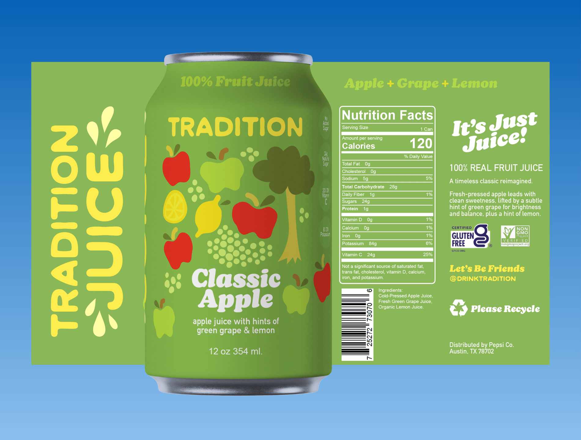
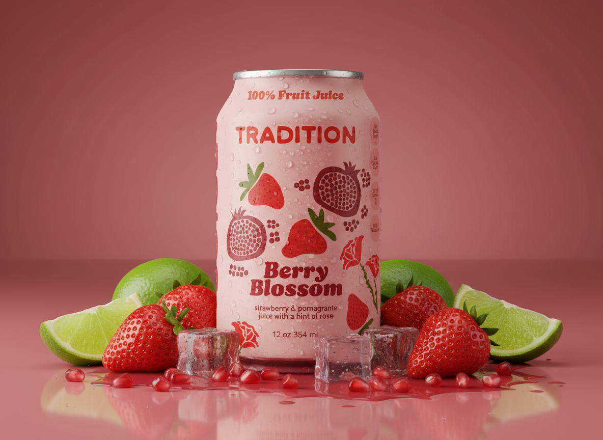
Tradition Juice (2026)
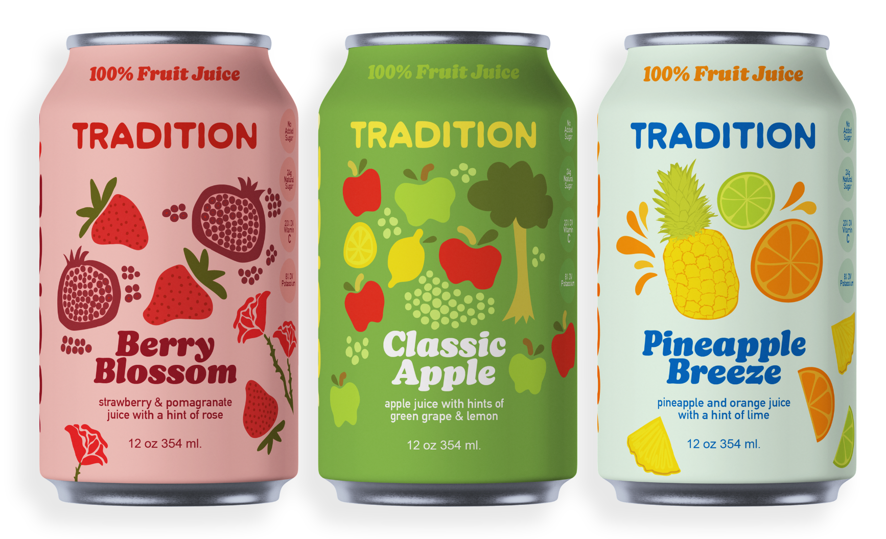
Tradition Juice needed packaging that felt elevated and nostalgic—something that honored classic juice flavors while standing apart from overly trendy or overly generic beverage packaging. The challenge was to create a canned juice brand that felt timeless, ingredient-forward, and quietly premium.
Problem
Most canned juices either lean childish and sugary or hyper-modern and sterile. There was an opportunity to position Tradition Juice as refined, ingredient-led, and rooted in simplicity—while still feeling fresh on shelf.
Decision
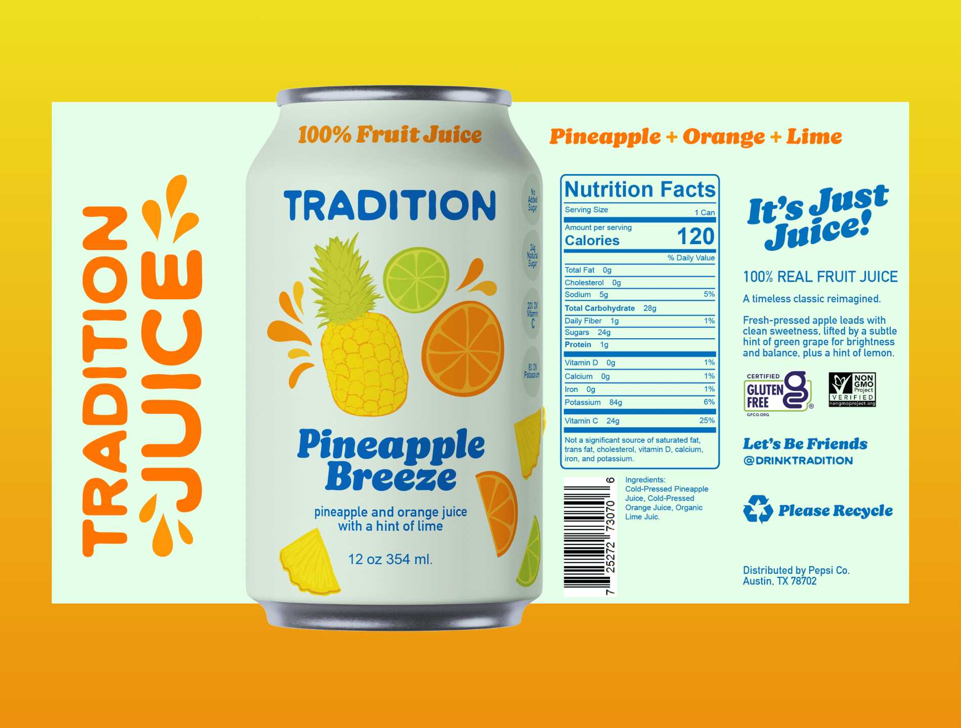
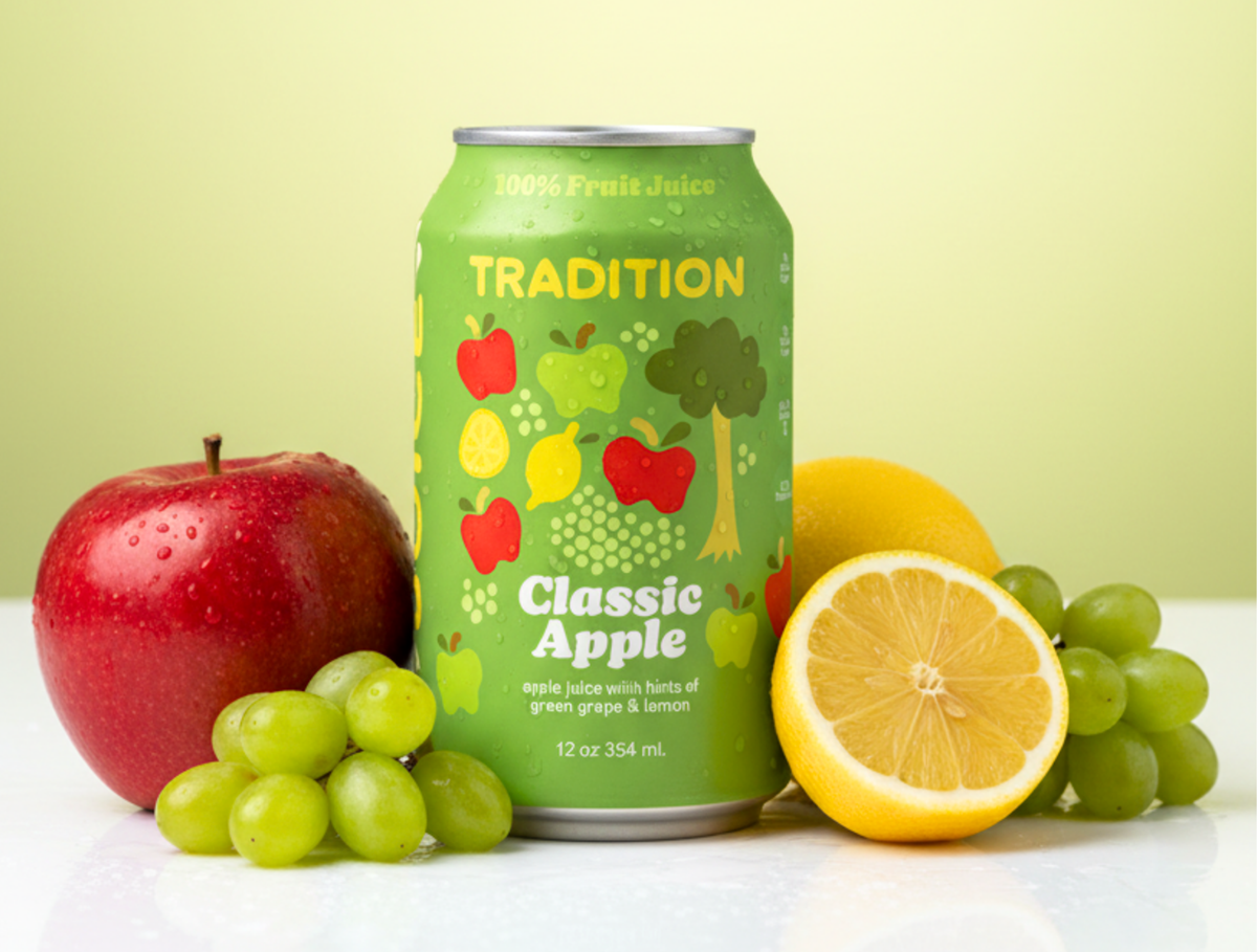
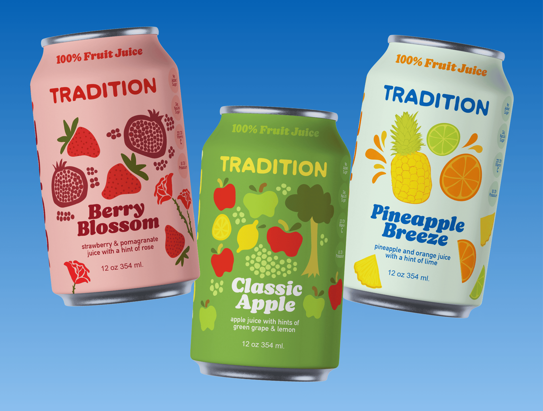
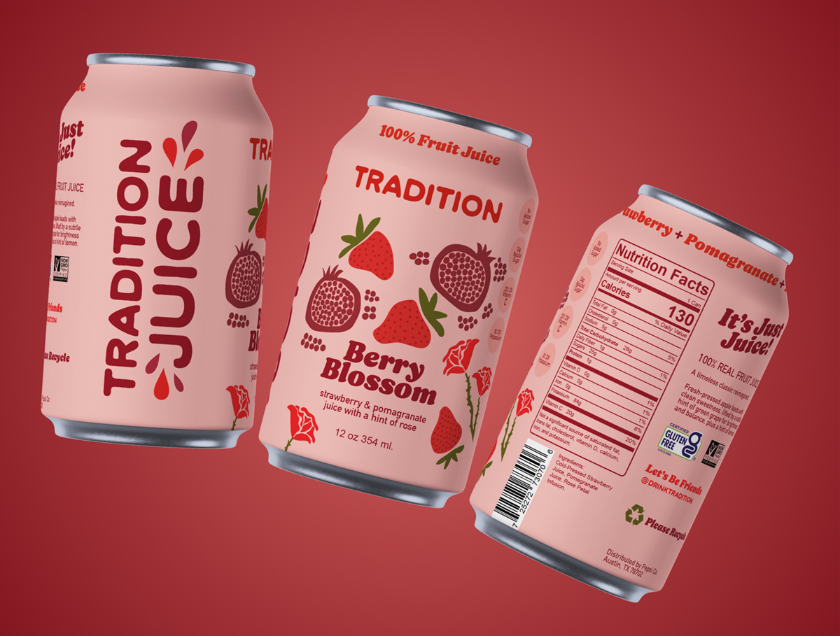
I developed the name Tradition Juice and built a packaging system around the idea of honoring classic flavor pairings with subtle, layered blends. Each variety—Classic Apple, Berry Blossom, and Pineapple Breeze—was designed to feel familiar yet elevated, highlighting cold-pressed ingredients and delicate infusions (like rose and lime) without overwhelming the core fruit.
The visual direction emphasized:
Clean, heritage-inspired typography
A restrained, natural color palette tied to each flavor profile
Minimal yet premium layout hierarchy to spotlight ingredients
A cohesive can system that feels collectible and intentional as a set
Outcome
The final concept positions Tradition Juice as a modern heirloom brand—approachable but refined. The packaging communicates quality at a glance, clearly differentiates flavors, and creates a strong, cohesive shelf presence across all three SKUs.
THIS IS A JUST FOR FUN PROJECT